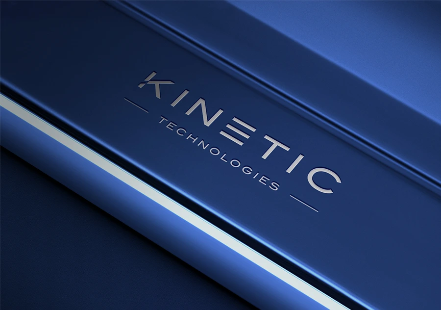
When we partnered with Kinetic Technologies, we weren’t just tasked with a visual update. We were tasked with a structural evolution. In the world of high-velocity tech, a brand that looks “static” feels obsolete. The challenge was to create a visual language that felt as fast and innovative as the technology it represented.
Movement as a Brand Pillar
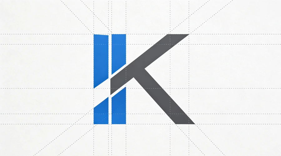
For Kinetic, motion isn’t a secondary effect; it’s a primary brand asset. We moved away from traditional tech tropes—blue gradients and generic “digital” patterns—and focused on the concept of “Momentum.”
The visual identity was built on a grid that allows for constant, rhythmic movement. This ensures that whether the brand is seen on a desktop or a high-speed digital display, it maintains a sense of “forward lean.” It’s about creating a brand that feels like it’s already in the future
Future-Proofing the Tech Identity
Engineering a tech brand in 2026 requires a deep understanding of scalability.
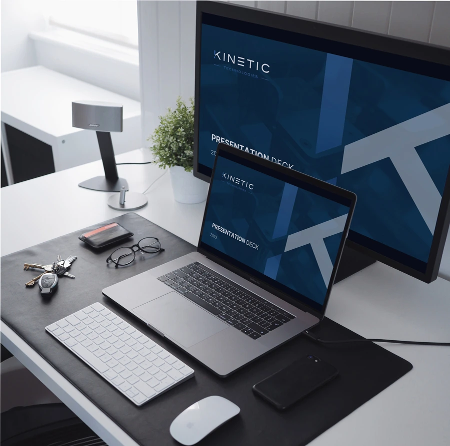
• The “Adaptive” Mark: We created a symbol that retains its integrity even when reduced to 16 pixels for a favicon or expanded for a trade show booth.
• The UI Bridge: The branding was designed to lead directly into the UI/UX. The lines, weights, and curves of the logo dictate the structure of the buttons and icons in the digital product.
• Strategic Simplicity: By stripping away the noise, we allow the product’s innovation to be the hero.
Product Feel
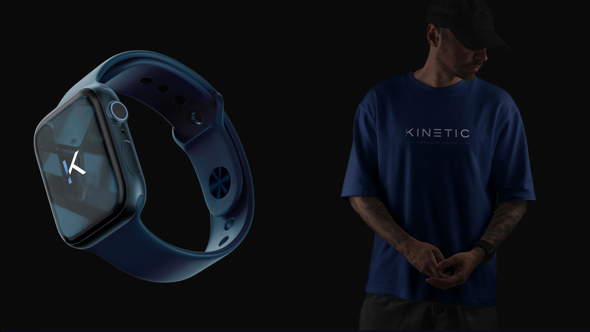
A great tech brand shouldn’t just explain what the product does; it should illustrate how the product feels.


