Seshaasai
Client:
Seshaasai Technologies
Industry:
FinTech
Scope:
Enterprise Transformation & Visual Systems
Partnerships For Progress
Engineering the “Art of Smart”
Evolving a 25-year legacy into a harmonious blend of symbols, shapes, and colors that reflect a Commitent to Innovation and Deep-Rooted Expertise.
Our strategic mandate was to evolve the brand from its 25-year “security printing” heritage into a future-ready Global Technology Innovator.
The core challenge was maintaining institutional trust while signaling aggressive technical modernization for a new generation of CXOs.


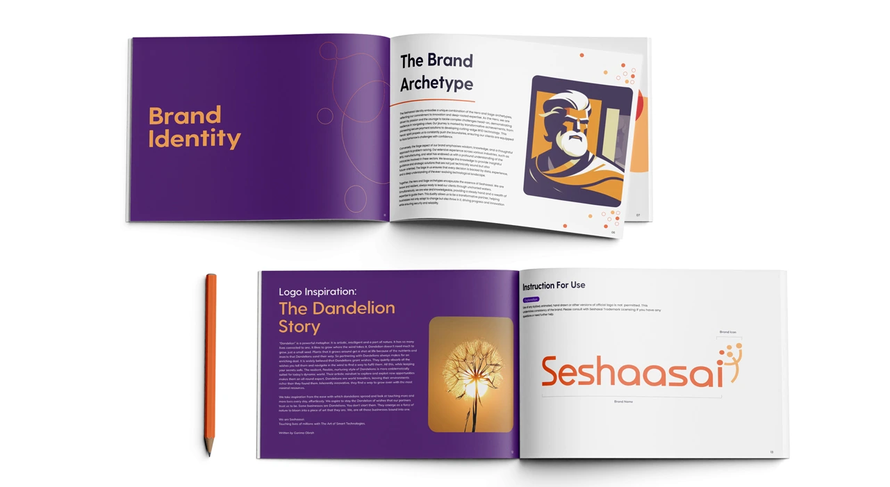
The Brand Archetype
A Transformative Partner
The Seshaasai identity embodies a unique combination of the Hero and Sage archetypes. This duality allows the brand to lead through uncharted waters while providing a steady hand of expertise.
Inspired by the Sanskrit word for Lord Vishnu—signifying the preservation of cosmic order—the name inspires a sense of Dharma (individual duty) in every technical solution provided.
01. Logo Evolution
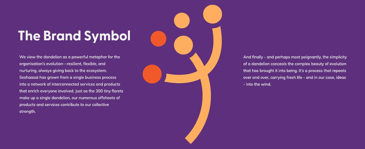
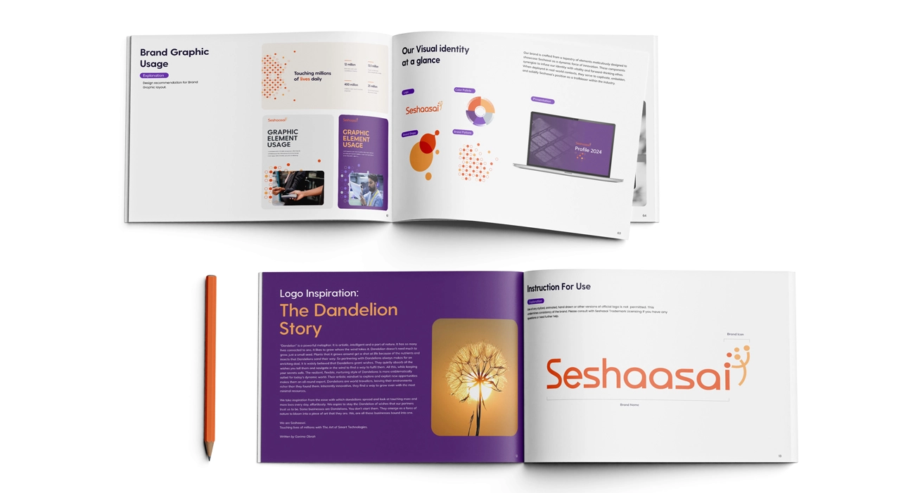
The Dandelion Metaphor
At first glance, a delicate plant seems at odds with RFID and credit card manufacturing. Yet, the dandelion perfectly embodies Seshaasai’s history
Proliferation
Just as 300 tiny florets make up a single dandelion, our numerous offshoots contribute to a collective strength.
Resilience
Thousands of years history of serving medicinal, industrial, and nutritive purposes.
The Wish
Symbolizing the moment a wish is made and florets disperse, creating new possibilities for the nation.

Title

Title
Title
Title

Title
Title
Title
Title
Title
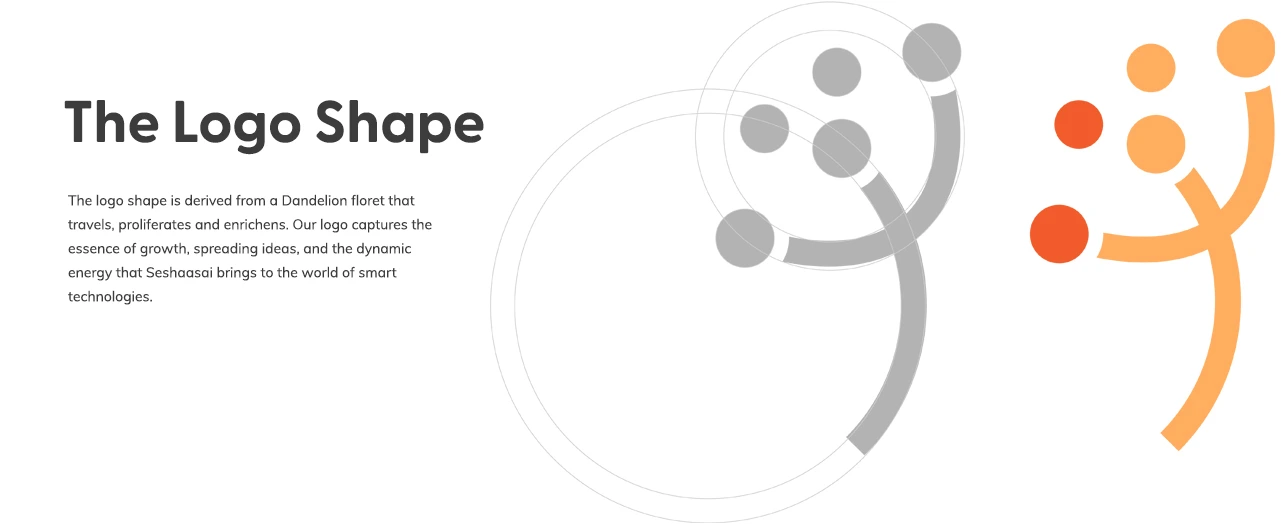
Kinetic Moment
The logo shape is derived from a Dandelion floret that travels, proliferates, and enriches. It captures the essence of growth and dynamic energy
300 Florets
Just as tiny florets make up a single dandelion, the numerous off-shoots of products (RFID, Smart Cards, Tax Tech) contribute to a collective strength.
Primary Palette
Flame Orange and Rajah: Hues of the rising sun reflecting new beginnings, innovation, and a commitment to illuminating the path forward.
#F15B2B
Agni & Movement
Symbolizes fire that burns away darkness and brings light (Knowledge). It represents high energy, momentum, and the quest for spiritual enlighten-ment
#FFAD5F
Spirituality & Optimism
Rooted in the virtue of a sublime sunrise, it symbolizes self-discipline and new beginnings. It reflects a vibrant spirit, driving innovation and a positive outlook toward the future.
#773DBD
The Sage & The Hero
02. ARCHITECTURE
Visual Systems
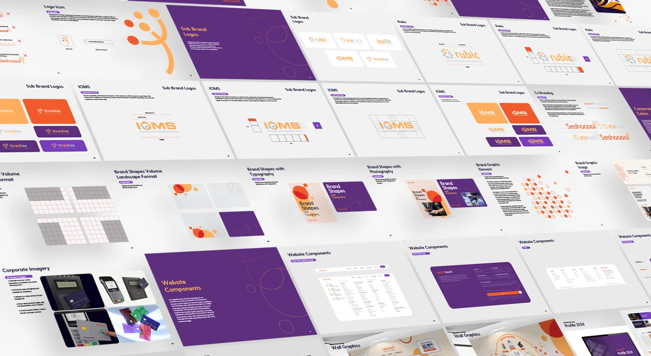
Managing a workforce of 1,200+ and a diverse product portfolio required a robust Visual Language System.
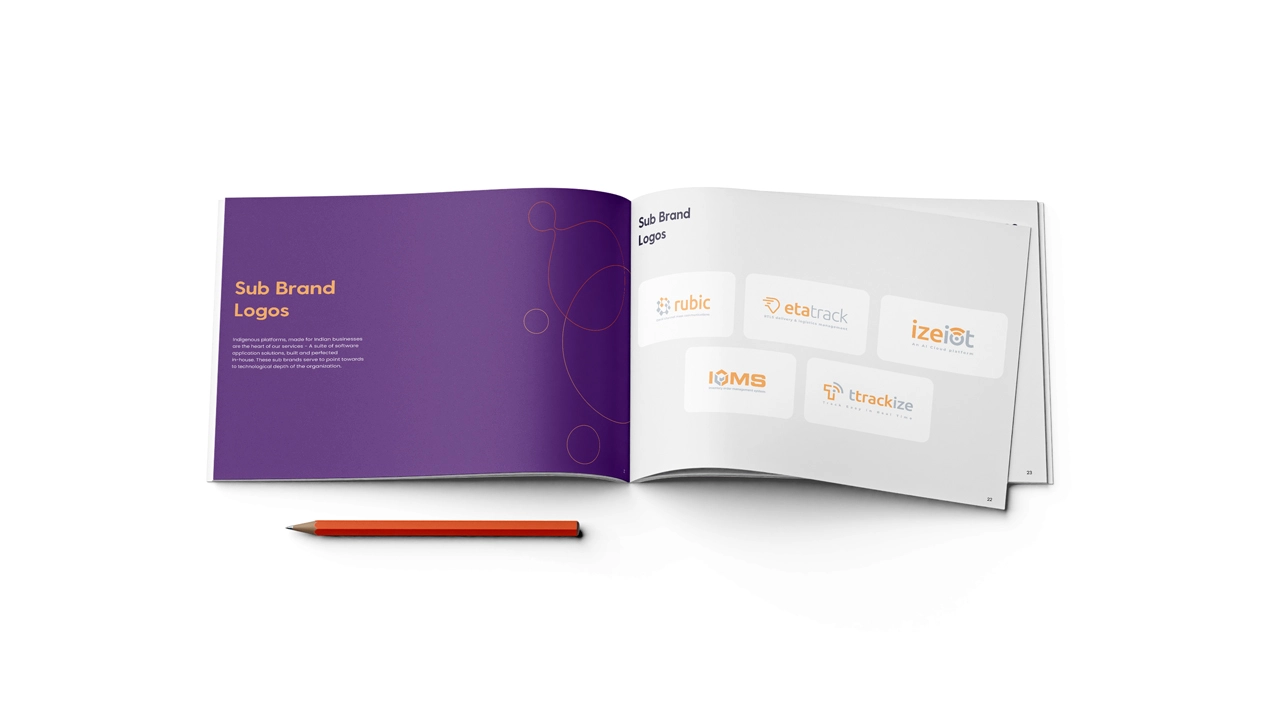
Monolithic Arch
Unique sub-brand hierarchy, ensuring niche technology products benefit from the parent brand’s equity.

Title

Title

Title

Title

Title

Title
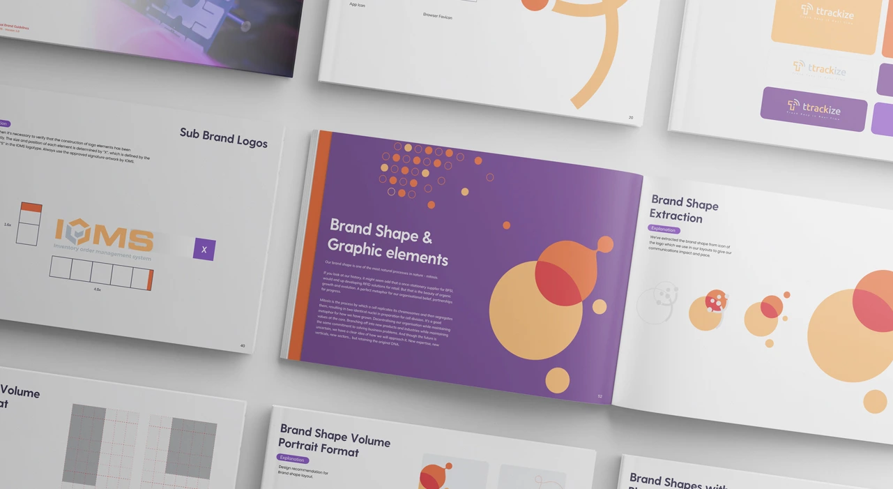
Brand Shape
The brand shape is one of the most natural processes in nature – mitosis. A process by which a cell replicates.

Title

Title

Title

Title
100 – Page Framework
A comprehensive Brand Guide defining everything Print to Digital usage
Title
Title
Title
Title
Title
Title
Title
Title
Title
Title
Title
Title
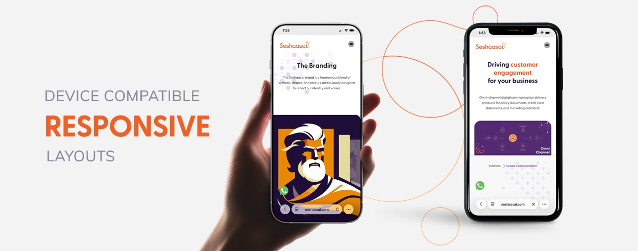
03. Digital Fortress
Enterprise Web Engineering
Diverse product portfolio required a robust Visual Language System and a future proof UX system.
Title
Title
Title
Title
Title

Title
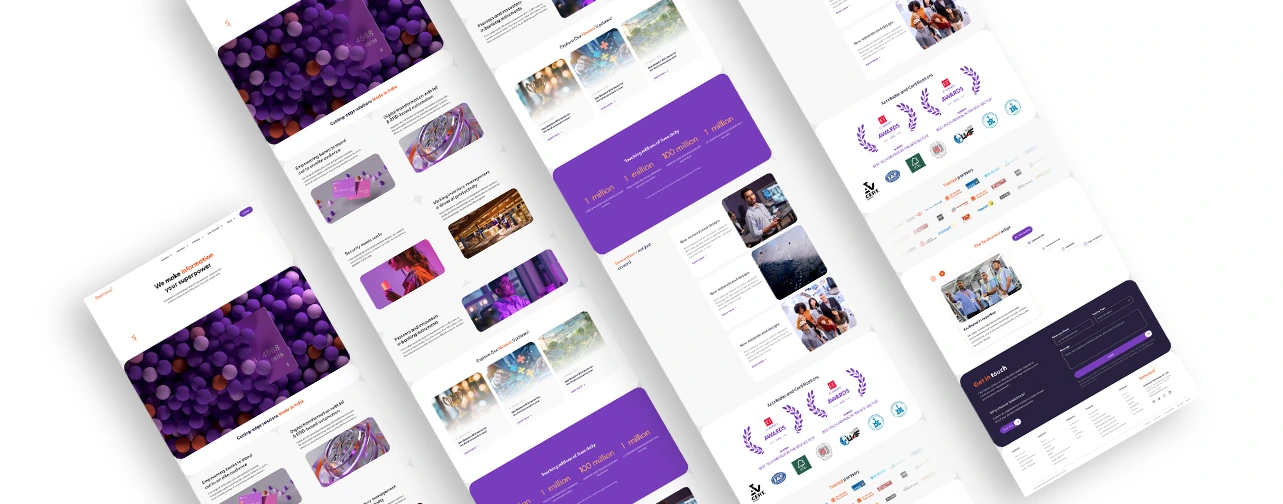
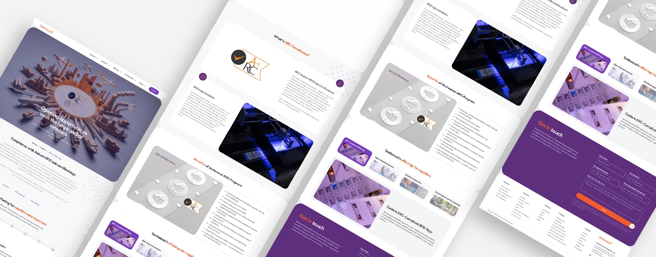
Information Architecture
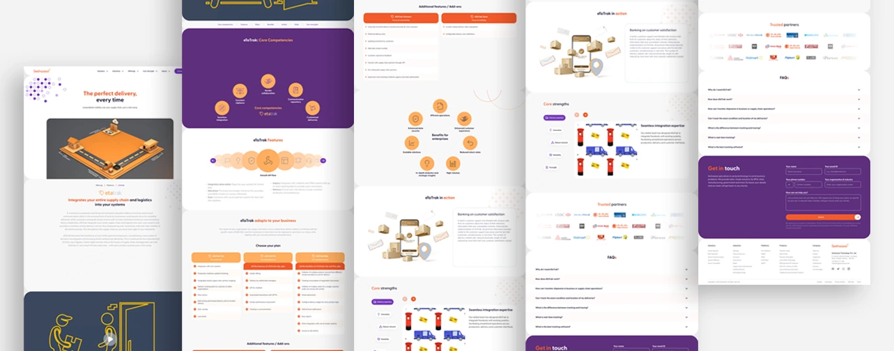
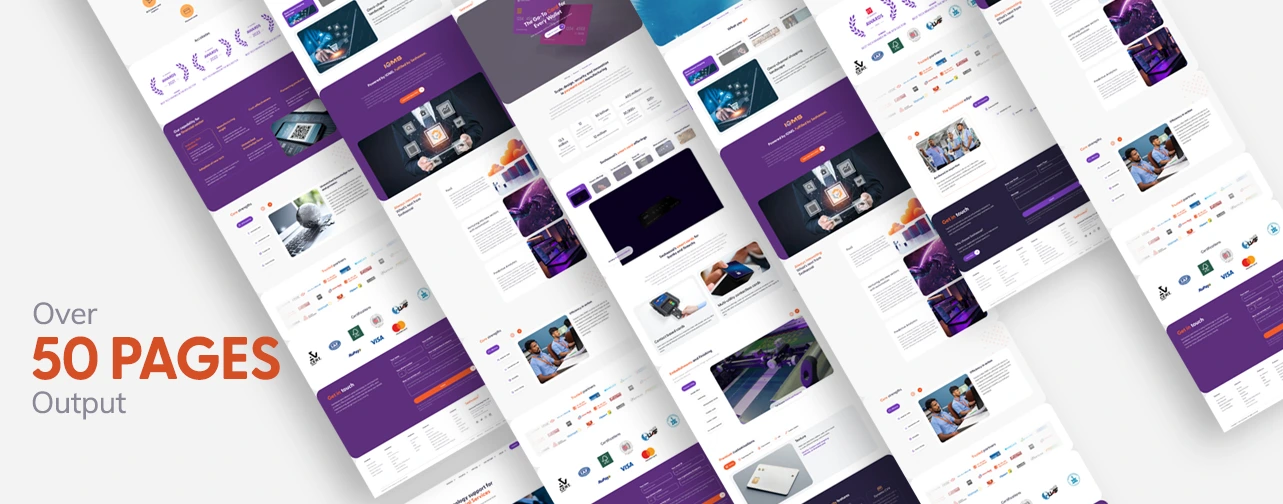
Mapped 50+ pages into a streamlined UX that segments users (Banking, Govt, Utilities) into targeted conversion funnels
Performance UX
Utilizing lean architecture and custom WordPress development to achieve “Speed-First” load times and Core Web Vitals excellence.
Security & Trust
The UI reflects a “Digital Iron Wall” aesthetic—clean, spacious, and mathematically precise.
04. Sales Enablement
Multi-Channel Execution
A 360-degree creative extension for the Seshaasai marketing team.
Motion Design
Multiple bespoke process animations translating complex “Smart Card” and “BPO” workflows into simple visual narratives..
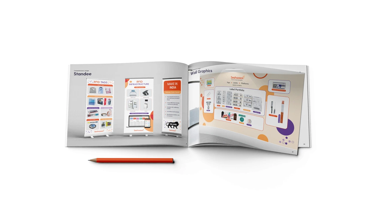
Physical Presence
Design of secure facility wall graphics, high-stakes event standees, and premium brochures for 1,200+ staff environment.


Enterprise Collateral
Bespoke PPT frameworks and data sheets that ensure technical accuracy and brand prestige in every RFP submission.


Business Outcome


")