

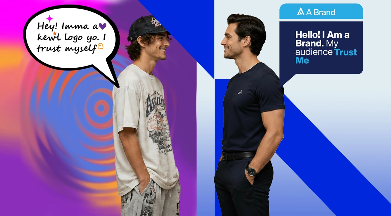
The misunderstanding around logos
Most conversations about branding begin in the wrong place.
A client sees a logo concept and immediately asks: “Do we like it?” That is a natural reaction, but it is not the most useful question.
A better question is: “Is this the right decision for the business we are building?”
A logo is one of the most visible parts of a brand, but it is not the brand itself. It is a symbol within a much larger system of meaning. That system includes strategy, positioning, visual language, messaging, audience perception, digital experience, customer experience, internal culture, and the way the business shows up repeatedly in the market.
The logo is important because it becomes a shortcut to recognition. Over time, people attach meaning to it. But the meaning does not come from the logo alone. It comes from the business promise behind it and the consistency of the visual system wrapped around that promise.
That is why a logo should never be judged as an isolated piece of artwork. It should be judged as part of the business equity.
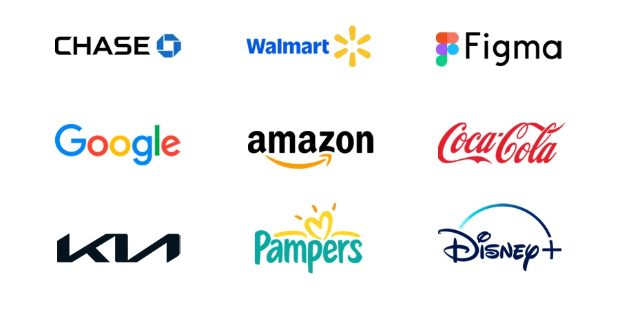
A logo is not good or bad in isolation
One of the most important things to understand is that a logo is rarely “good” or “bad” by itself. The decision behind the logo is what makes it strong or weak.
A mark that feels too simple to one person may be exactly right for a company that needs clarity, confidence, and long-term recognition. A complex logo that looks impressive in a presentation may fail the moment it appears as a small social media icon, an app tile, a building sign, or a black-and-white document stamp. This is why experienced brand strategy is not about decorating a company. It is about making choices that hold up under pressure.
A strong logo decision considers the business model, audience, category, competitive landscape, company ambition, real-world applications, and the emotional and commercial role of the brand.
A logo for a healthcare company should not be evaluated the same way as a logo for a luxury hospitality group. A fintech identity should not be judged by the same criteria as a children’s education brand. A corporate acquisition firm, a food company, a real estate developer, and an AI startup all require different signals of trust, energy, sophistication, and memorability.
Good branding is contextual. The wrong logo is often not ugly. It is simply misaligned.

Branding is the system, not the symbol
A logo is a symbol. Branding is the system that gives that symbol authority.
That system includes colour, typography, spacing, imagery, iconography, layout, tone of voice, website experience, presentation design, social media presence, packaging, signage, documents, and customer touchpoints.
When all of these elements work together, the brand starts to feel intentional. It becomes recognizable before the audience even reads the name.
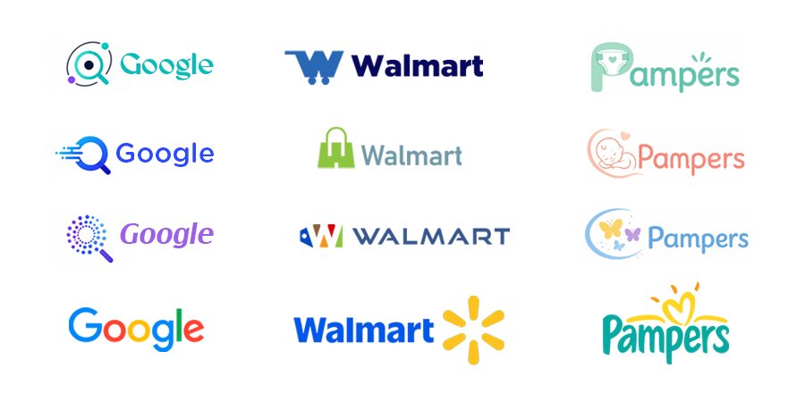
This is why large brands are not remembered only because of their logos. Apple, Nike, FedEx, Mercedes-Benz, Mastercard, and Google are not powerful because their marks are complicated. They are powerful because their identities are applied consistently, supported by clear behaviour, and reinforced through every customer interaction.
The logo opens the door. The brand system builds the memory.
Why business leaders should evaluate logos differently
A business owner, founder, or executive is not choosing a logo for personal enjoyment. They are choosing an asset that will represent the company in sales conversations, investor meetings, digital campaigns, hiring, partnerships, customer service, and market positioning. That requires a different lens.
The question is not: “Which option looks the nicest?”
The better questions are:
“Which option gives us the strongest strategic advantage?”
“Which option will be easiest for our audience to recognize?”
“Which option can scale with the business?”
“Which option creates the right perception before we even speak?”
“Which option can support a full visual system?”
The best identity decisions are usually not the loudest ones. They are the ones that keep working after the initial excitement fades.
What clients should look for before approving a logo
Before approving a logo, business leaders should evaluate it through strategic filters, not just personal preference. These are the areas that determine whether a logo can perform as a long-term brand asset.
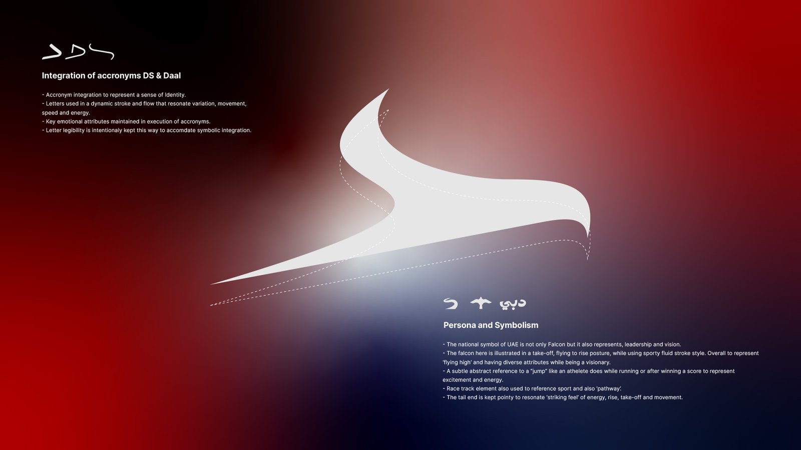
Strategic alignment
The logo should reflect the direction of the business, not only how the company looks today. It should support the brand’s positioning, ambition, and future growth.
Distinctiveness
A logo should create recognition. It needs a clear visual idea that helps the brand stand apart in a crowded market.
Audience perception
The logo should be evaluated through the eyes of the audience. The right identity creates the right expectation before a conversation even begins.
Functional performance
A logo has to work beyond the presentation slide. It should perform across websites, social icons, signage, print, documents, presentations, and digital applications.
Visual system potential
A strong logo should be able to inspire a larger brand language. Its shapes, colours, proportions, or design logic should extend naturally into other brand assets.
Quality of execution
Good ideas still need professional execution. Spacing, proportion, typography, alignment, curves, and file preparation all affect how finished and credible the brand feels.
Category relevance
Every industry has familiar visual codes. A strong logo understands those codes without becoming generic or predictable.
Simplicity with purpose
Simplicity is not about making something plain. It is about removing noise so the core idea becomes easier to understand and remember.
Business value
A logo has value when it supports trust, recall, consistency, and credibility. It should help the business look prepared, focused, and easier to take seriously.
Scalability
A logo should scale with both size and business growth. It needs to work on a small mobile screen today and still make sense as the company expands tomorrow.
Timelessness
A logo should feel current without depending too heavily on trends. Strong fundamentals usually last longer than effects, styles, or visual fashion.
Ease of adoption
A logo system should be practical for the team to use. Clear variations, rules, spacing, colours, and file formats help protect consistency over time.
Emotional clarity
Every logo creates a feeling. The important question is whether that feeling matches the business strategy and the audience’s expectations
The mistake of choosing by taste alone
Personal taste will always be part of the process. Design is visual, and people naturally respond to what they like. But taste is not a reliable business filter.
A founder may prefer a certain colour because it feels familiar. A team may prefer a complex option because it looks more “designed.” A stakeholder may reject a simple logo because it feels too easy. Another may want the logo to explain every service because they fear the audience will not understand the business.
These reactions are understandable, but they are not strategic.
The role of a strong branding process is to move the conversation from preference to purpose.
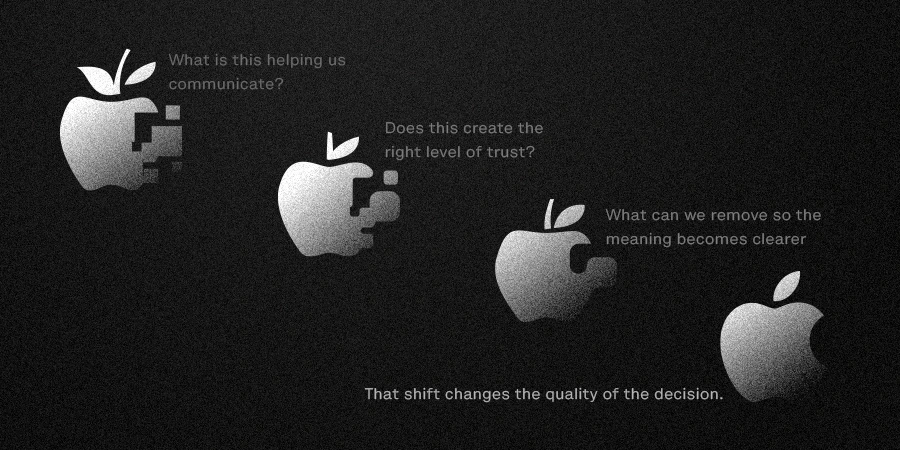
Instead of asking, “Do we like this?”
We ask, “What is this helping us communicate?”
Instead of asking, “Does this look expensive?”
We ask, “Does this create the right level of trust?”
Instead of asking, “Can we add more meaning?”
We ask, “What can we remove so the meaning becomes clearer?”
That shift changes the quality of the decision.

The logo is the beginning of recognition
A logo does not become powerful on the day it is approved. It becomes powerful through use.
Through repetition. Through consistency. Through customer experience. Through marketing. Through credibility. Through the business keeping its promises.
When a logo is supported by a strong brand system, it becomes familiar. When it becomes familiar, it becomes easier to trust. When it is trusted, it becomes an asset.
That is the long-term value of branding. Not simply looking better. Being remembered more clearly.
A logo is not branding. A logo is one decision inside a much larger brand system.
But it is an important decision because it becomes the most repeated visual signature of the business. It appears before meetings, after proposals, inside presentations, across websites, on social platforms, and in the minds of customers. That is why it deserves more than a quick opinion.
The best logo decisions are not based only on beauty. They are based on clarity, relevance, distinction, functionality, scalability, and strategic fit.